Familiarisation with the User Interface
Dashboard
Overview
This section will help to familiarize you with the layout on the Dashboard page of the DataChannel Console.
-
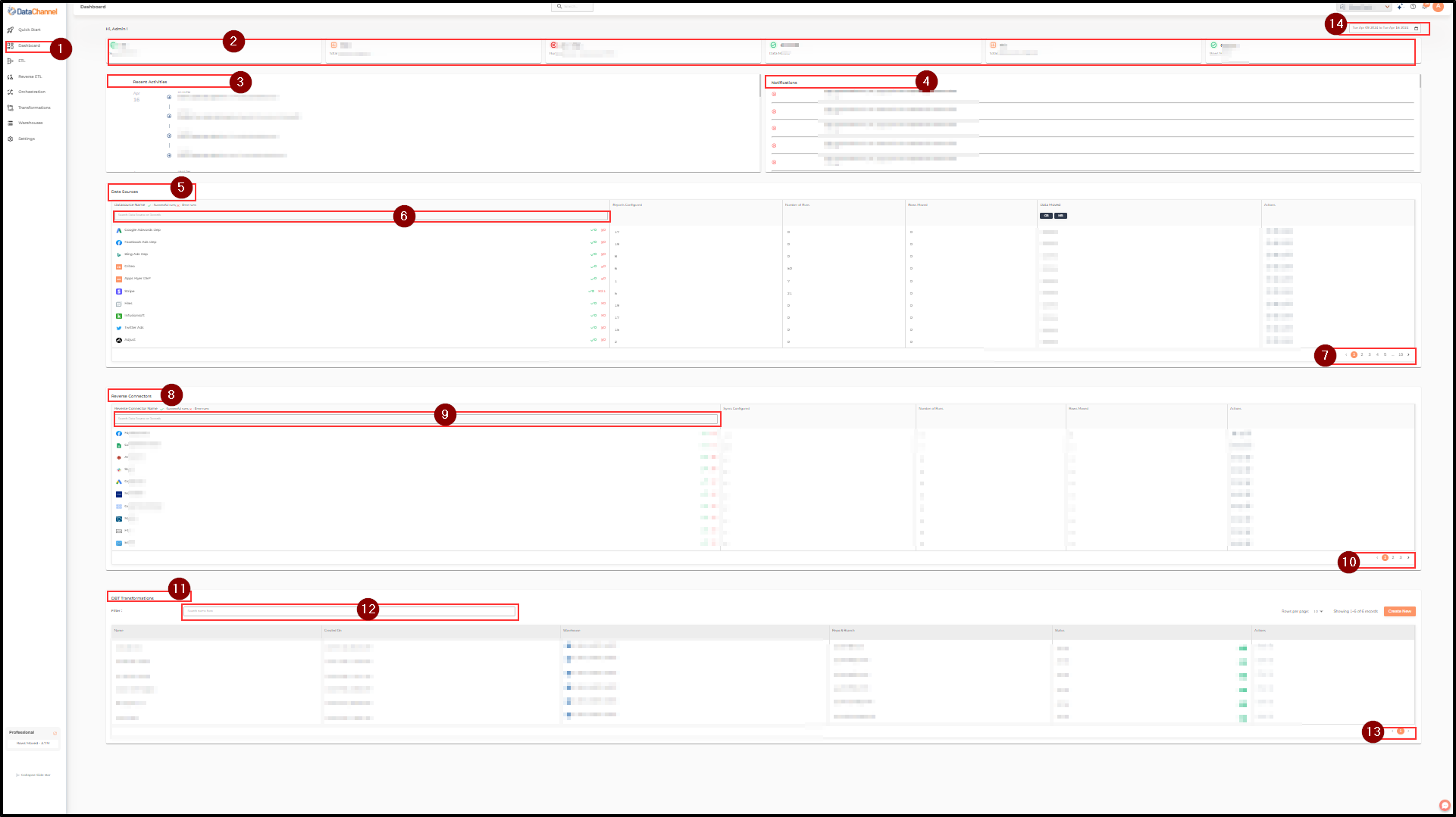
You can access the Dashboard by clicking on the Dashboard Tab which is the second icon on the sidebar, right below the Quick Start Tab. Once there, you’ll notice that the Main UI screen on the Home page is divided into a number of cards and panes which give you a snapshot of metrics related to your DataChannel account.
-
Under the Top banner you’ll notice metrics for total rows processed this month to date and total data processed in the immediate past 24-hour window compared to the previous 24-hour period. You can hover over the info (i) icon to know who are your top contributors for this month. It also has a View Details button which takes you to the Data Usage pane in the Settings Tab where you can view the detailed analytics for your account usage.
-
Below the account metrics card, you have a Recommended Actions card which have a Invite your Teammates button that allows you to invite your teammates to join your DataChannel account. You can click on the Invite your Teammates button to send an invite to your teammates. It will take you to the Users pane in the Account Settings Tab where you can add new users to your account. You can also view the list of your previously invited teammates and their status in the same card.
-
Below the Recommended Actions card, you have a Scheduled Jobs in your account card which displays the number of scheduled jobs in your account. You can filter the scheduled jobs by clicking on Yesterday, ], btn:[Today and Tomorrow buttons. You can also select a specific date to check the scheduled jobs for that date by clicking on the date picker box. It will give you a snapshot of the number of scheduled jobs run every hour for the selected date.
-
The top right corner of the Scheduled Jobs card has another filter option which allows you to filter the scheduled jobs by their status. You can filter the scheduled jobs by clicking on All, Success, Error, Run Initiated and Upcoming Runs checkboxes. It will give you a snapshot of the number of scheduled jobs run every hour for the selected date and status.
-
Maximum of six scheduled jobs are displayed in a grid at each hour timeline. You can click on the View All button at the bottom of the grid to view the complete list of scheduled jobs for the selected date and status. It will display the complete list of scheduled jobs for the selected date and status. You can use the scroll bar on the right side of the page to navigate up/down through it.
-
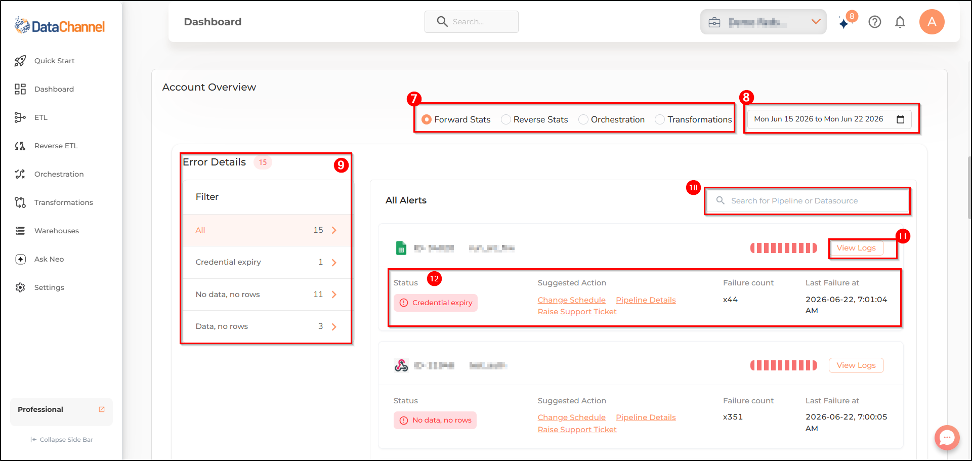
Below the Scheduled Jobs card, you have a Account Overview card which displays the forward stats, reverse stats, orchestration, and transformation details for your account. You can filter the details by clicking on Forward Stats, Reverse Stats, Orchestration and Transformation radio buttons.
-
The top right corner of the Account Overview card has another filter option which allows you to filter the details by a date range. You can filter the details by clicking on Last 7 Days, This Month, Last Month, This Year and other options. You can also choose a custom date range. It will give you a snapshot of the details for the selected date range.
-
You can find the Error Details card at the top of the Account Overview card which displays the all alerts for your account. You can filter the alerts by clicking on All, No data, No rows, data, No rows and Credential Expiry buttons.
-
You can also search for specific pipeline or data source in the Error Details card by entering the name of the pipeline or data source in the search box. It will give you a snapshot of the alerts for the selected pipeline or data source.
-
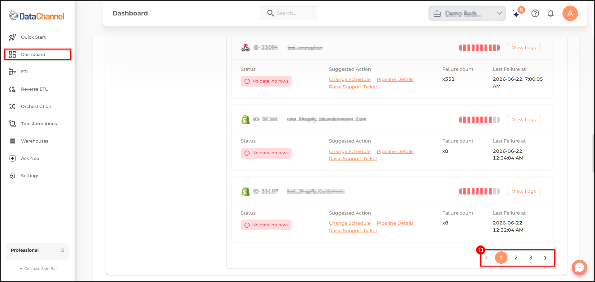
Each alert in the Error Details card gives you the logs for the related event. You can click on the View Logs button to view the detailed logs related to the alert.
-
Each alert in the Error Details card gives you the status, suggested actions, failure count and last failure at timestamp.
-
Navigating between different pages of the alerts is possible through the page numbers on the navigation bar, near the bottom right corner of the All Alerts pane.
-
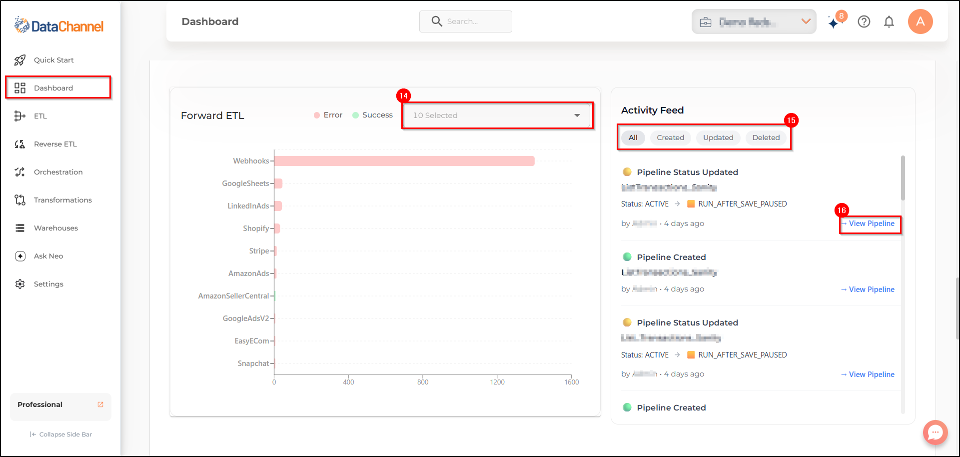
Next, we have a Forward ETL card or Reverse ETL card which displays the graph for errors and success of your configured forward and reverse connectors. You can choose at most 10 connectors to view the graph for errors and success of your configured forward and reverse connectors from the dropdown list. You can hover over the bars in the graph to view the number of errors and success for each connector.
-
You can find the Activity Feed card to the right of Forward ETL card or Reverse ETL card which gives status of the pipelines that you have created, deleted, updated in your account recently. You can filter your feed by clicking on All, Created, Updated and Deleted buttons.
-
Each notification has a View Pipeline link that will take you to the setup of that particular pipeline where you can edit and run the particular pipeline.
-
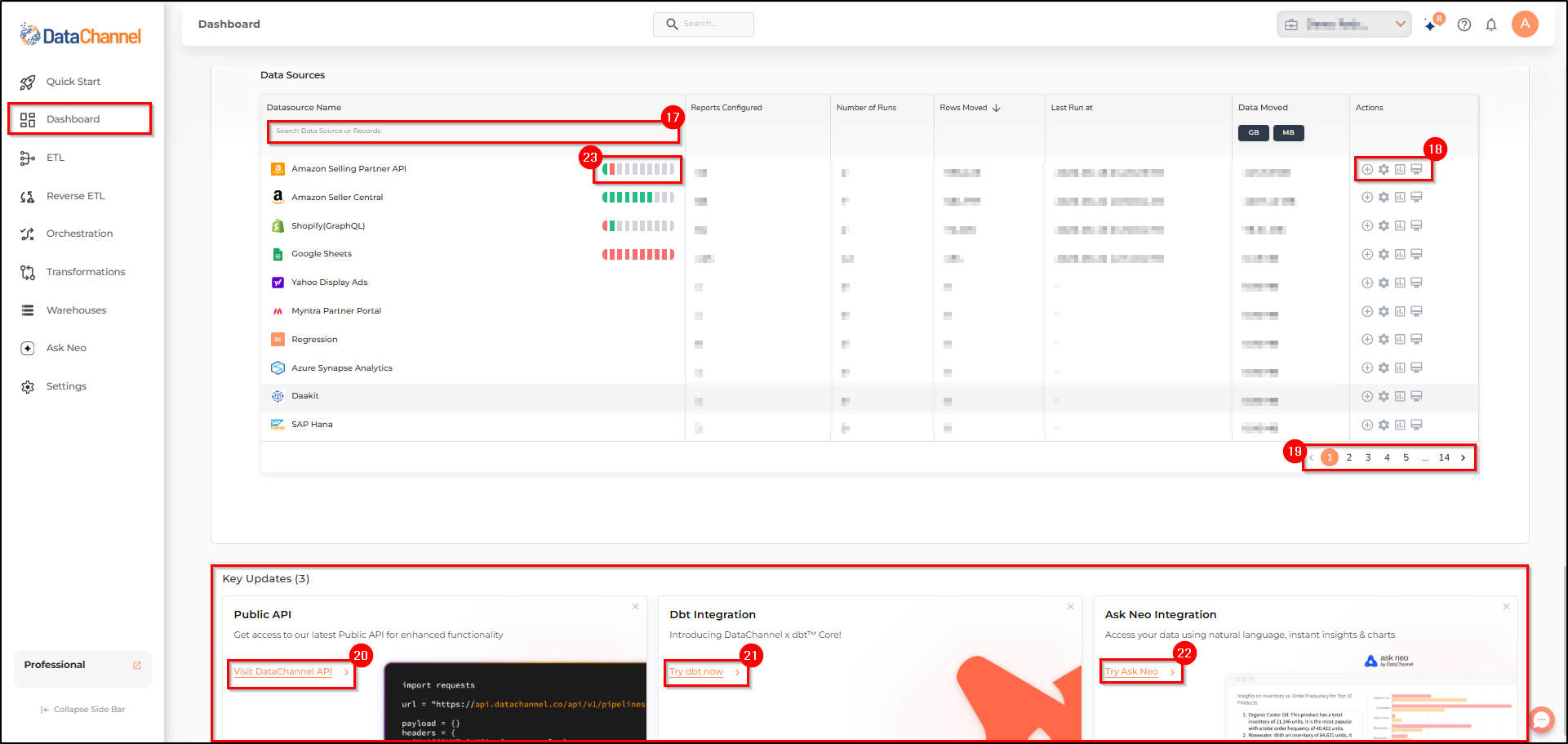
The bottom of Account Overview card displays the list of data sources or reverse connectors along with their details related to number of runs, rows moved and last run timestamp. You can search a specific connector or reverse connector by entering the name of the connector or reverse connector in the search box.
-
The last column of the data source and reverse connector table has the Actions section where you can add a data pipeline, view details, configure a data pipeline, and view credentials.
-
Navigating between different pages of the Data Sources or Reverse Connectors is possible through the page numbers on the navigation bar, near the bottom right corner of the Data Sources or Reverse Connectors pane.
-
The bottom card in the dashboard is Key Updates. you can get access to DataChannel API for latest functionality here.
-
You can also integrate and manage your transformations using Dbt Core by clicking here.
-
Integrate Ask Neo and get access to instant insights from the data stored in your data warehouse here.
-
The first column in the data source and reverse connector table displays the status of the scheduled run of that particular connector or reverse connector at varied interval. Different colors show different status of the scheduled run. You can hover over each color to know the execution time of that particular run.
Still have Questions?
We’ll be happy to help you with any questions you might have! Send us an email at info@datachannel.co.
Subscribe to our Newsletter for latest updates at DataChannel.